
Leo Messi Logo
Identity Design
2010
The Lionel Messi identity was a joint effort between several U.S. and European adidas design teams. The work was completed on a very compressed timeline, starting with all of the participants submitting 3-5 concepts each. After lengthy critiques one of my concepts was chosen as the decided direction.
Phase Two consisted of all of the designers, around thirty in total, supplying their own iterations of the three stripe crest concept. Once again, it was decided that my iterations were the most effective.
The global identity team took over the closing phase to finalize the mark and establish the system standards.
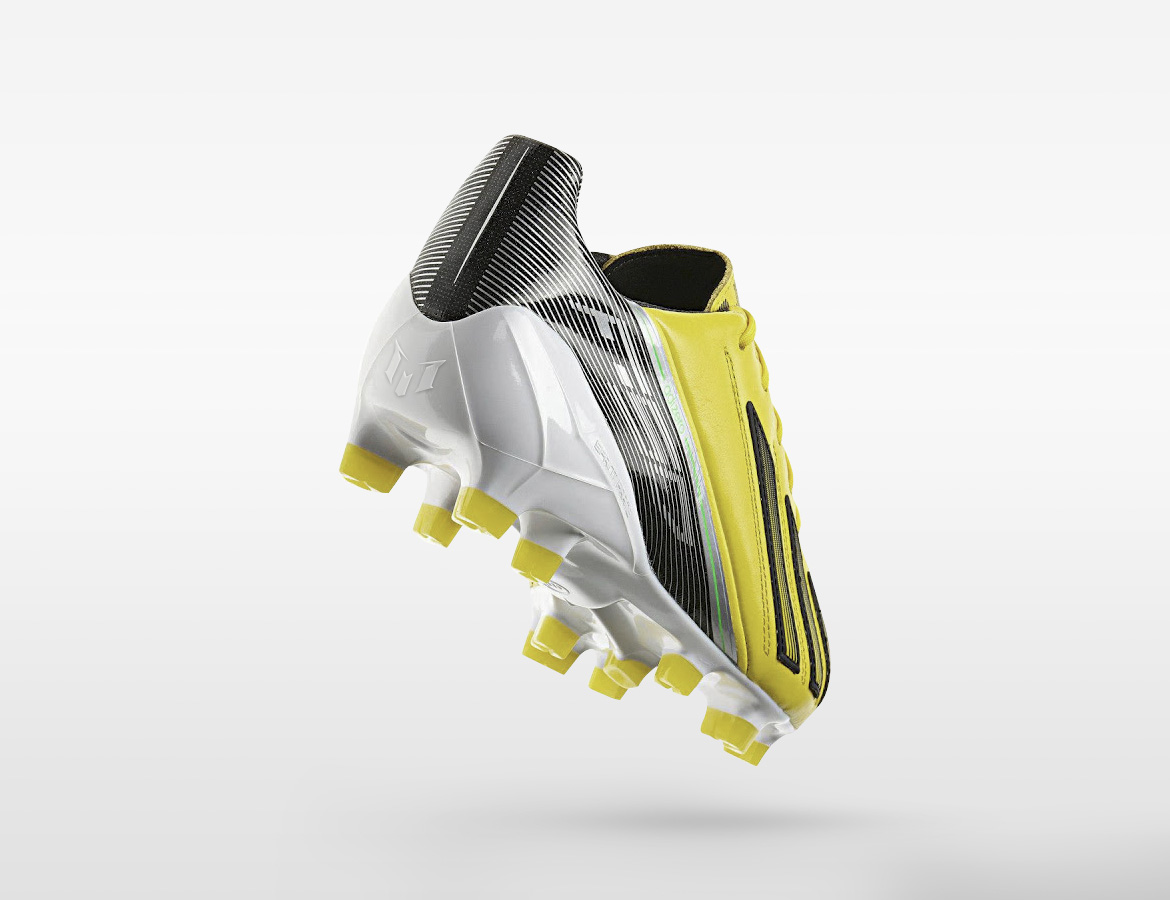
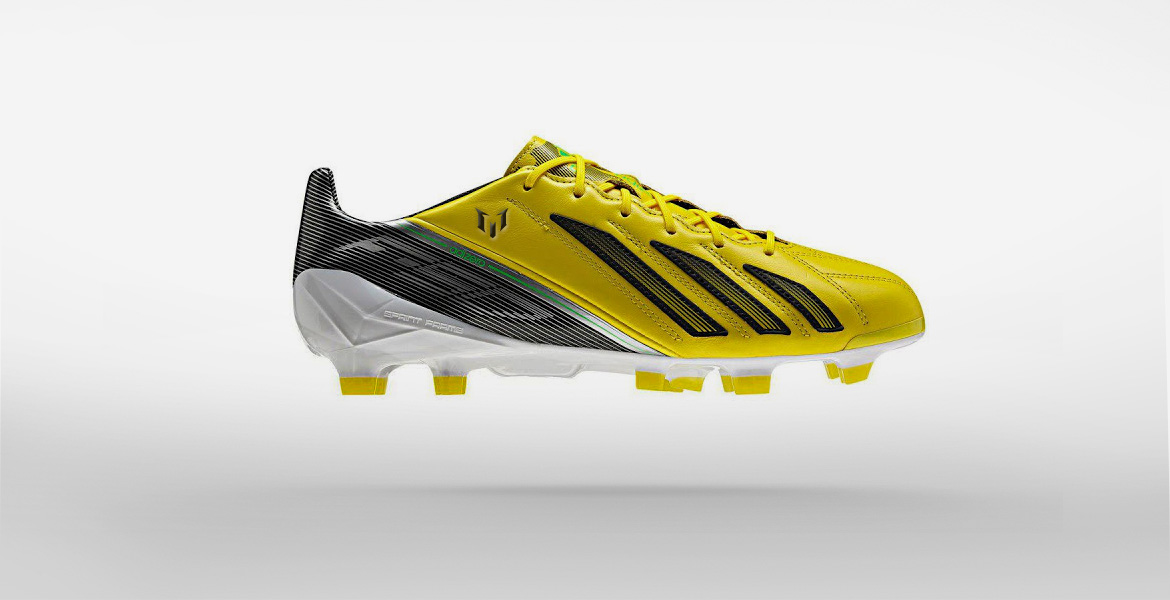
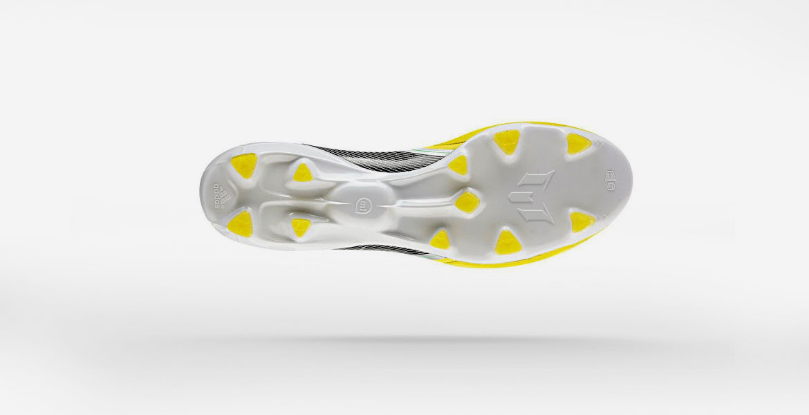
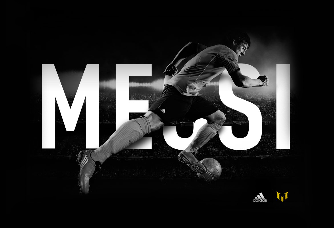
I created all of the images above as mock-ups to help others envision how the mark could be implemented on product and marketing materials.
1. This mark integrates three visual components into a single design. It incorporates the adidas Three Stripes. It takes on the simple silhouette of a traditional soccer crest. It can be read as an "M" for Messi.
2. The mark needed to feel somewhat explosive, like Lionel Messi's playing style. Serifs were extruded from the top left and top right to add outward movement to the logo.
3. Bottom serifs were added to counter-balance the top serifs. Interior notches were carved in to bring more clarity to the "M" read. Note that every angle plays off its corresponding angle. Nothing is arbitrary.
4. The global identity team finalized my concept. They brought out the fluidity of Messi's game by rounding the corners and smoothing any aggressive angles.